
*
Rebrand & Design
FUEL BOOTCAMP
A brand identity for a local fitness team built around energy, community, and a down-to-earth feel, creating a place that feels more like home than a polished corporate gym.
Challenge
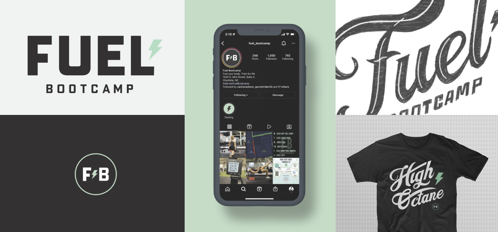
A local HIIT gym wanted a fresh identity that felt small, gritty, and community-built, not like another polished corporate fitness brand. It needed to stand out on Instagram while reflecting the energy members get from both the workout and the people around them.
Solution
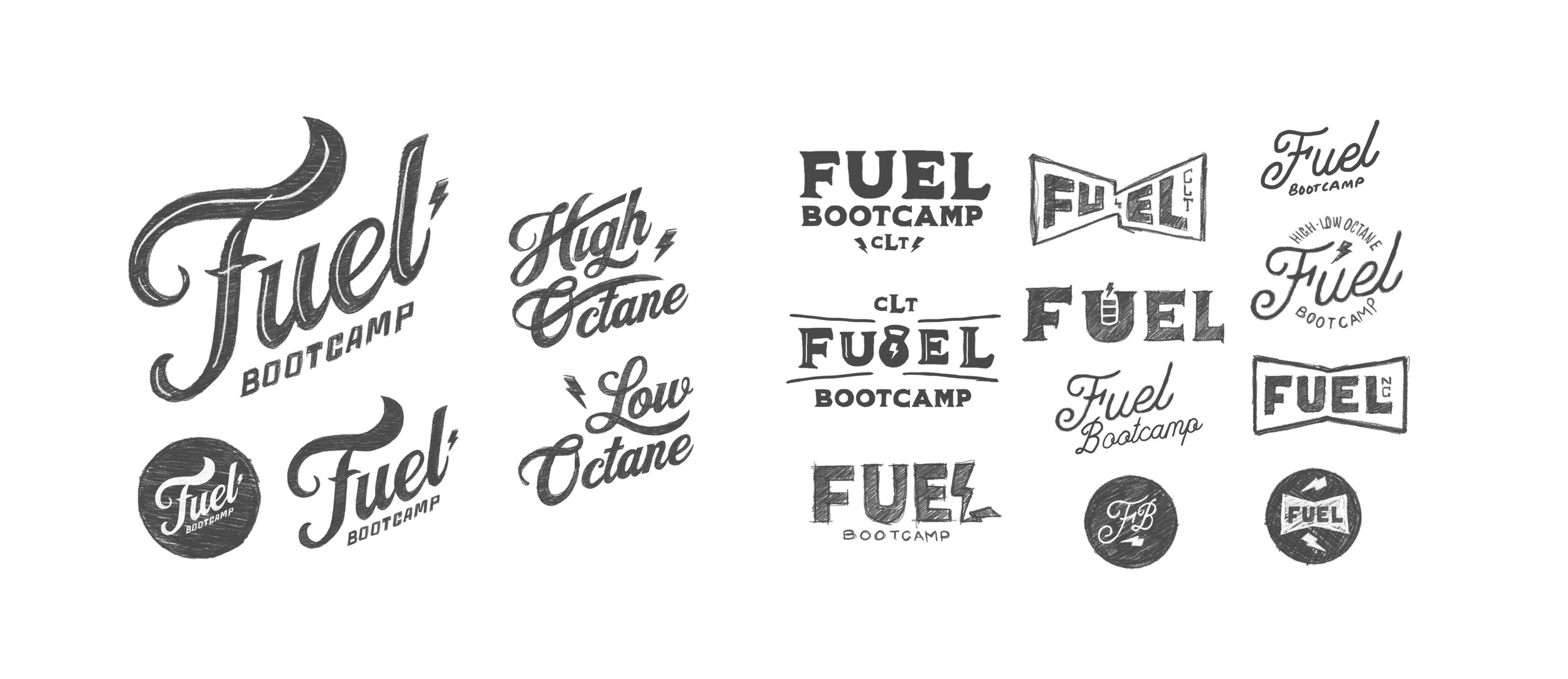
We built the brand around that dual sense of fuel: the physical charge of a great workout and the lasting support of a tight-knit community. An old-school typeface gave the identity its grounded, no-frills character, while a simple bolt added just enough energy to make the mark feel alive and memorable. The new identity helped drive increased membership, expand programming, and support a move into a larger second location, all while keeping the community-first spirit at the center.
THE WORK

The List
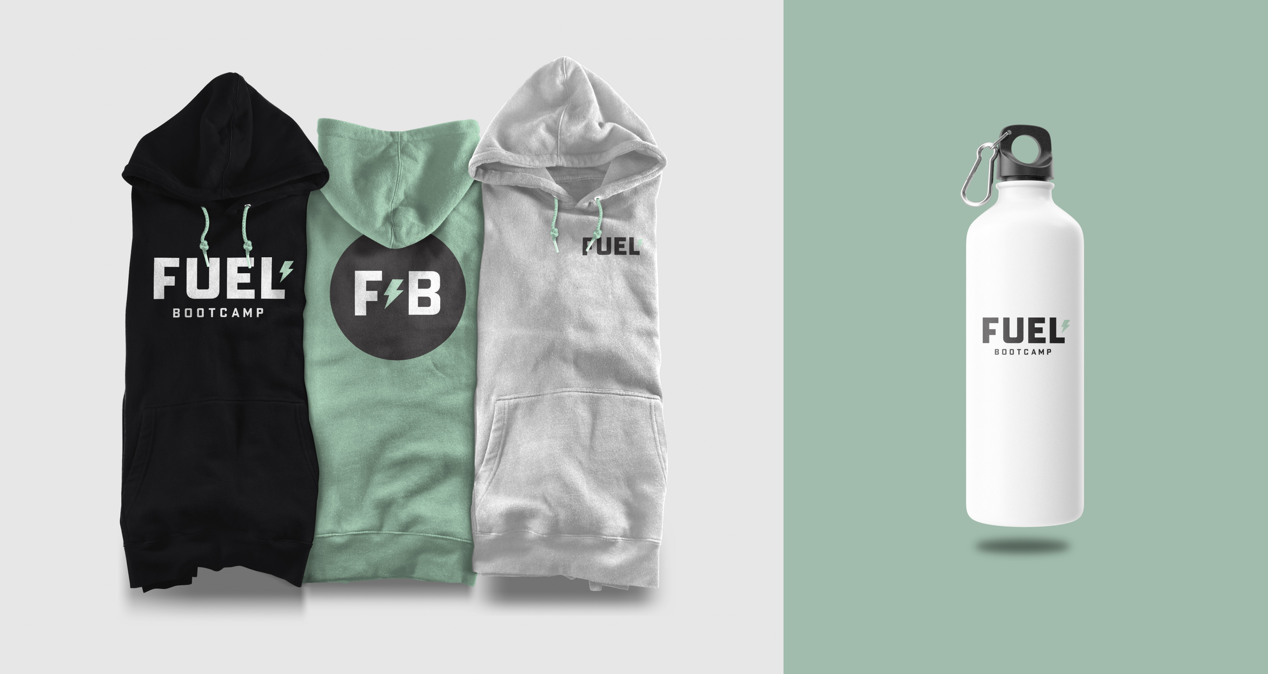
Logo / Brand Guidelines / Social Platforms / Swag / Interior Space
SEE MORE WORK

LET’S CONNECT
For a creative leader who’s as collaborative as they are hands-on,
send me an email or download my résumé.